PRODUCT MANAGEMENT · FULL CASE STUDY · 2026
TesseraHealth
A voice-first AI care coordination platform for elderly patients in India, built to close the loop between the nurse who notices, the family who worries, and the doctor who has seven minutes.
- TIMELINE
- 2026
- ROLE
- PM · Research, Design & Build
- STACK
- React · Firebase · Azure OpenAI GPT-4o · React-PDF
- METHOD
- User Interviews · Affinity Mapping · JTBD
HOW THIS STARTED
I found this problem in a product management classroom, not a hospital
TesseraHealth started as a class project in Product Management for Tech Companies at Northwestern, taught and mentored by Prof. Birju Shah from Kellogg School of Management. The assignment was open-ended. I picked elder care coordination in India because the structural problem was too obvious to ignore once I started looking at it: 149 million people in India are 60 or older, and almost all of them are cared for at home by a rotating cast of family members, part-time nurses, and agency-dispatched carers who share no common record and no common platform. A family member is often in a different city entirely. Nobody has the full picture, and everybody assumes someone else does.
The clearest way to see the scale of it: a single patient can go through up to 21 shift handoffs a week. Every one of those is a moment where a nurse's observation either makes it into a shared record, or it doesn't. Most of the time, it doesn't.
THE PROBLEM
Three people, three phones, zero shared record
It would have been easy to frame this as a feature gap: build a better logging app, ship it, done. That is not what this is. The home nurse documents in a paper register and a WhatsApp thread. The family coordinates over phone calls and a separate WhatsApp group. The physician sees the patient for seven minutes every few months with whatever the family remembers to say out loud. Three people, each doing their part conscientiously, and none of them reading from the same page, because there is no page. Up to 21 shift transitions a week means 21 separate chances for a critical observation, a medication change, a breathing pattern, to disappear between one person's memory and the next person's attention. This is a systems problem. Fixing one person's experience without fixing the handoffs between all three doesn't close the loop.
THE RESEARCH
Three interviews, thirty minutes each, and the ER story showed up twice
I ran three semi-structured interviews, 30 to 40 minutes each, designed to surface what people actually do and have experienced rather than what they think a researcher wants to hear: a remote family caregiver in Delhi, a home care nurse in Mumbai, and an outpatient physician in Jaipur.
Priya Nair, 38, Delhi — remote family caregiver
"The nurse is fantastic. She notices everything. The problem is that what she notices stays with her. It doesn't go anywhere useful."
"I found out my mother's blood pressure had been spiking for three days because she mentioned it on a Sunday phone call. Not from the nurse. Not from anyone."
"The last ER visit, I was on a flight. My husband was trying to reconstruct her medication list from memory and a photo of a prescription from four months ago. It was terrifying."
Ravi Shankar, 31, Mumbai — home care nurse
"I write in the register every day. But I don't think anyone reads it. The next nurse who comes, she just asks me verbally when I'm leaving. That's the handoff."
"I noticed Mr. Patil's breathing had changed over two days. I told the family on WhatsApp. Did the doctor know? I don't think so."
"If I could just speak into my phone for one minute at the end of the shift, that would be enough. I don't want to type. I don't have time to type."
Dr. Sunita Agarwal, 54, Jaipur — outpatient physician
"A family comes in with a folder. Inside is a discharge summary from 2022, two prescriptions, and a lab report. That is the medical record. That is what I have to work with."
"I ask: how has she been at home? And the family says: fine, doctor. Fine. What does fine mean? I don't know."
"If someone sent me a one-page summary before the appointment, I would read it. It would have to be one page. I have seven minutes. I cannot read a report."
Three things from these conversations changed the product outright. First, the ER scenario wasn't a hypothetical I was designing against, it was lived experience. Two of the family caregiver respondents had already been through an ER visit where medication got reconstructed from memory under stress. Second, the physical register turned out to be a ritual, not a tool. Nurses write in it because they're expected to, not because anyone downstream actually reads it. Third, the physician's format constraint wasn't a preference I could negotiate on. One page, bullets, seven minutes. That's not a design choice. That's the ceiling.
THE SYNTHESIS
Affinity mapping turned three conversations into five patterns
I grouped every raw quote, observation, and behavioral data point from all three interviews by pattern instead of by respondent. Five themes came out of it, and each one pointed directly at a product decision rather than staying an abstract insight.
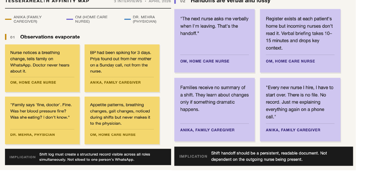
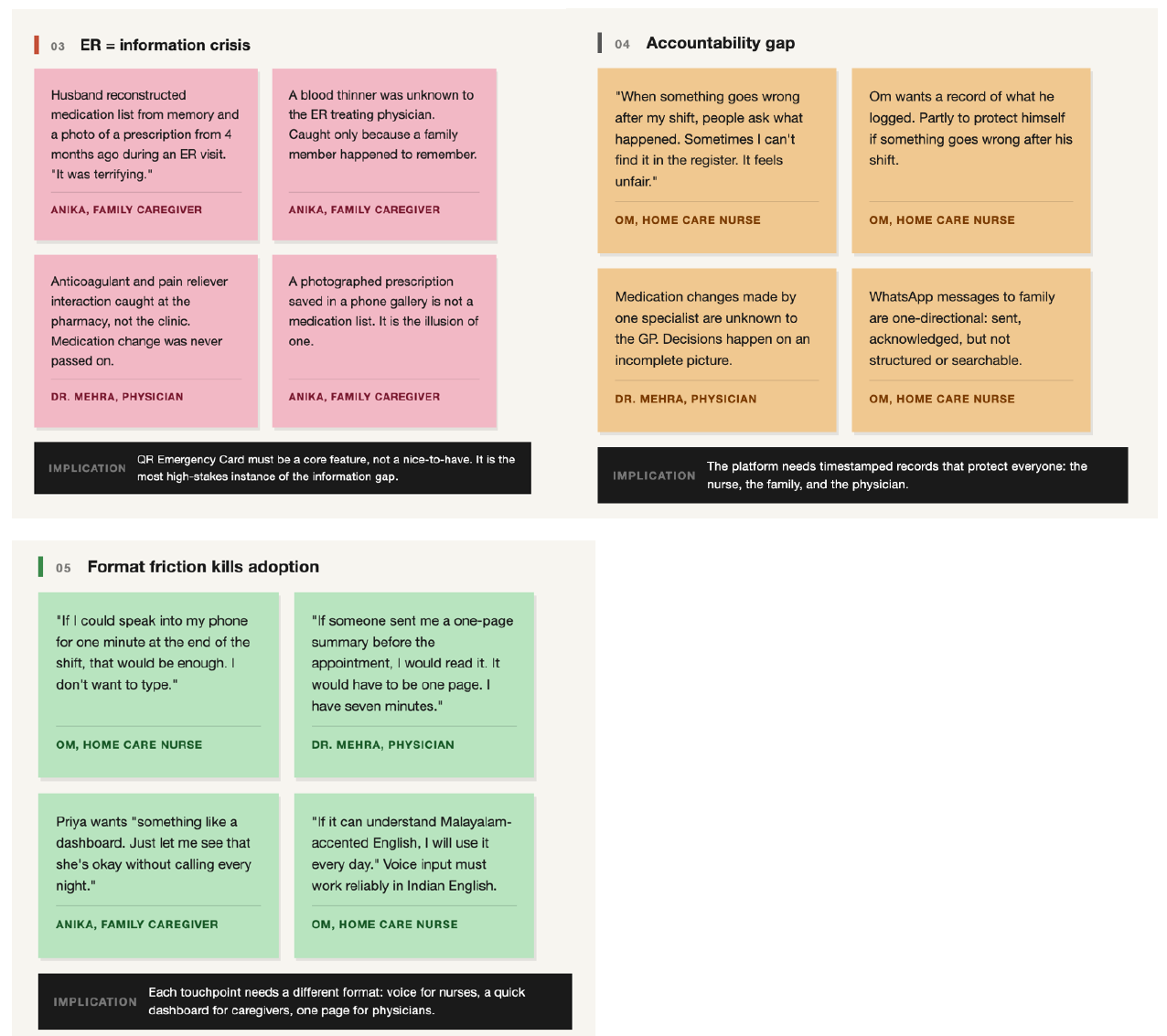
Observations evaporate
Shift log must create a structured record visible across all roles simultaneously. Not siloed to one person's WhatsApp.
Handoffs are verbal and lossy
Shift handoff should be a persistent, readable document. Not dependent on the outgoing nurse being present.
ER = information crisis
QR Emergency Card must be a core feature, not a nice-to-have. It is the most high-stakes instance of the information gap.
Accountability gap
The platform needs timestamped records that protect everyone: the nurse, the family, and the physician.
Format friction kills adoption
Each touchpoint needs a different format: voice for nurses, a quick dashboard for caregivers, one page for physicians.
THE PERSONAS
Built after the interviews, not before
All three personas existed in draft form before I talked to anyone. What matters is what changed once I actually did.
Anxious Anika — the remote family caregiver
"The nurse is fantastic. She notices everything. The problem is that what she notices stays with her."
What the interviews changed
- Before interviews, I assumed the core frustration was the lack of a shared record. After, it's more specific: families trust the nurse's competence but have no pathway to benefit from it. The observation just evaporates.
- The backup medication list families rely on, a photo of an old prescription in a phone gallery, isn't a medication list. It's the illusion of one.
- Willingness to pay showed up unprompted. That shifted my confidence in a direct-to-family revenue tier I hadn't planned around.
Overworked Om — the home care nurse
"If I could just speak into my phone for one minute at the end of the shift, that would be enough."
What the interviews changed
- The physical register is less a documentation tool than a ritual. Nurses write in it because it's expected, not because it serves a function anyone downstream depends on. My real competition isn't the register, it's inertia.
- The accountability angle was underweighted going in. Om isn't only looking for convenience, he wants a record that protects him professionally when something goes wrong after his shift.
- Accent and language are a real constraint, not an edge case. Om explicitly asked whether voice logging could handle Malayalam-accented English.
Dr. Mehra — the outpatient physician
"If someone sent me a one-page summary before the appointment, I would read it. I have seven minutes."
What the interviews changed
- The format constraint is non-negotiable, and more specific than I'd assumed: one page, bullet points, nothing that requires clinical interpretation. That's not a preference, it's the hard ceiling of a seven-minute consultation.
- Physician trust cuts in two directions: not just whether the data is accurate, but whether nurses will log consistently enough for the summary to mean anything. Nurse adoption has to come first.
- The clearest validation of the whole thesis: a missed anticoagulant interaction, caught at the pharmacy instead of the clinic, because a between-visit medication change never reached the physician.
THE COMPETITIVE LANDSCAPE
Everyone solves one piece. Nobody closes the loop.
Paper and WhatsApp, hospital EHR systems and India's ABDM infrastructure, and consumer health apps each serve exactly one role in isolation. None of them connect the carer's daily observation to the family's awareness to the physician's decision.
| Feature | Paper / WhatsApp | EHR / ABDM | Consumer Apps | TesseraHealth |
|---|---|---|---|---|
| Daily carer logging | No | No | Partial | Yes, voice-first |
| Cross-role visibility | No | No | No | Yes, real-time |
| Physician pre-visit brief | No | No | No | Yes, AI-generated |
| ER emergency access | No | Partial, facility only | No | Yes, QR no-login |
| Shift handoff record | Paper only | No | No | Yes, structured |
WHAT SHIPPED IN V1
Four features, and every one of them is load-bearing
The MVP delivers the core loop end to end: a carer logs by voice, the family sees it in real time, the physician gets a structured brief before the appointment, and the ER has no-login access to what matters. Everything else, physician post-visit notes, multi-language voice, an agency dashboard, is v-next or later.
- F1
Voice Shift Logging
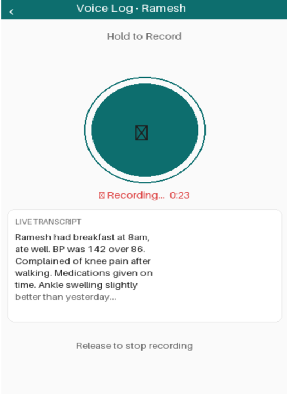
Carer holds the mic, speaks naturally for 60 to 90 seconds, and Azure OpenAI GPT-4o structures it into vitals, meals, complaints, and medications. Directly answers Om: every nurse interviewed cited typing speed as the reason observations go unrecorded.
- F2
Family Caregiver Dashboard
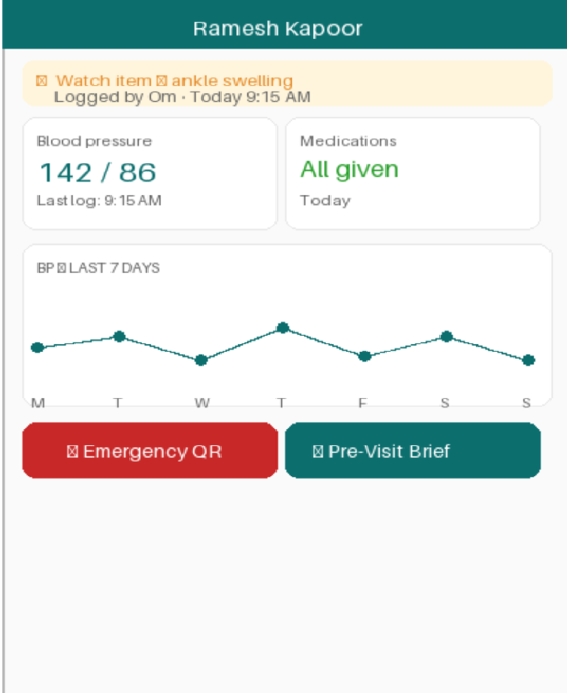
Real-time status, last-log timestamp, and a 7-day trend, with no phone call required. This is Priya's own words back at her: 'something like a dashboard, just let me see that she's okay without having to call every night.'
- F3
AI Pre-Visit Physician Brief
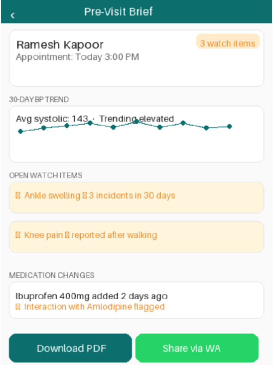
A one-page, on-demand PDF summarizing the last 30 days: vitals trend, medication changes, flagged watch items. Built to the exact constraint Dr. Agarwal named unprompted: one page, bullets, readable in seven minutes.
- F4
Emergency QR Card
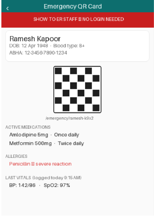
A public, no-login URL showing active medications, allergies, and the most recent vitals, built for a triage nurse to read in under three seconds. This came directly out of the ER theme: the highest-stakes instance of the information gap in the entire study.
The prioritization logic wasn't impact versus effort.
It was: does removing this feature break the loop for at least one persona? Every one of these four does. Cut the voice logging and Om never logs at all. Cut the dashboard and Anika is back to calling every night. Cut the physician brief and Dr. Mehra never gets the format she said she'd actually read. Cut the QR card and the highest-stakes scenario in the whole study goes unaddressed. That's the whole prioritization argument.
THE PROCESS
The parts of the work that don't show up in a screenshot
A product case study usually shows the finished screens. Here's the work underneath them.
Interview guide
18 questions across three respondent types, designed to surface behavior over opinion.
Affinity map
Five themes synthesized from all three interviews, each with a product implication. Embedded above.
Personas
Three personas, rebuilt post-interview with an explicit 'what changed' section each. Embedded above.
User stories
20 stories across all three personas, each with acceptance criteria.
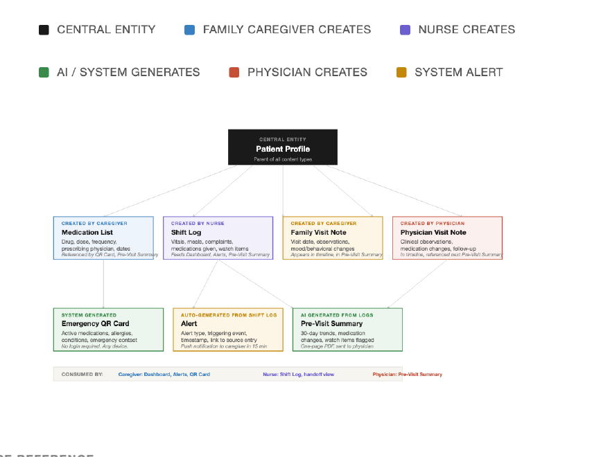
Content model
The eight information types the platform manages and how they relate, centered on the patient record.
Wireframes
12 screens across the carer, family, and physician flows. Key screens embedded below.
MVC architecture table
The model, view, and controller layer for every major feature, mapped for engineering handoff.
Full PRD
Vision, personas, competitor benchmarking, design principles, feature rationale, and roadmap.
DESIGN PRINCIPLES
Six rules, each one a decision with a reason
★ Logging must be faster than the workaround it replaces.
If Om's shift log takes more than two minutes, it will be abandoned. Every design decision about the logging flow gets evaluated against this constraint first, before anything else.
The weakest link in the care chain determines the platform's value.
A beautiful family dashboard built on no carer data is worthless. I designed from Om outward, not from Anika inward.
Continuity over completeness.
A partial daily log submitted consistently is worth more than a comprehensive log submitted once a week. The product should never make the user feel they have to do it perfectly to do it at all.
No login should stand between an ER physician and a medication list.
The emergency QR card is the one place TesseraHealth removes authentication entirely. Clinical urgency overrides access control.
AI is a structuring layer, not a clinical decision-maker.
Every AI output is surfaced as a summary or a flag, never a diagnosis. The physician brief is labeled AI-generated and built as a support tool for clinical review, not a clinical record.
Admire the simplicity of WhatsApp and the trust of a discharge summary.
TesseraHealth should feel as easy as messaging and as trustworthy as an official document, at the same time.
THE PRODUCT
What it looks like end to end
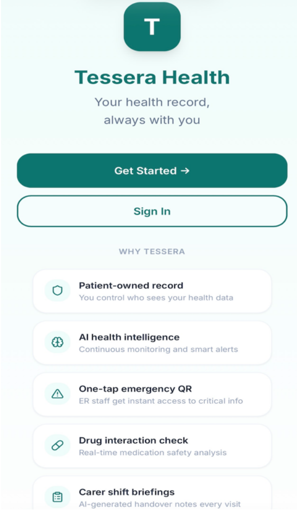
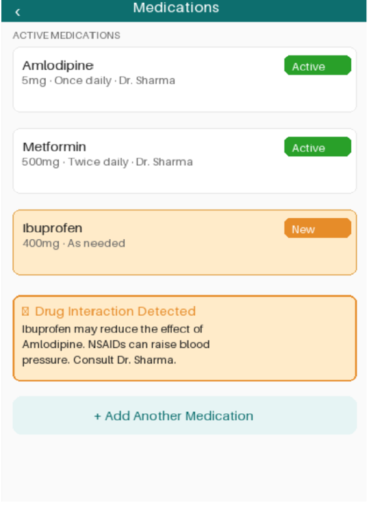
Four screens across the flow: the landing screen, voice input for the carer, the family caregiver dashboard, and AI-flagged drug interactions on the medication list.
TRADEOFFS
Three bets I made deliberately
VOICE-FIRST OVER TYPED INPUT
This wasn't a UX preference. Every nurse I talked to described typing mid-shift as the reason observations go undocumented. Voice is the only input method that actually survives a real shift.
WEB APP OVER NATIVE APP
No install barrier was a deliberate adoption decision, not a resource constraint. A carer who has to find an app store, download, and sign up before logging a single shift is a carer who never logs a first shift.
AI AS STRUCTURING LAYER, NOT DECISION-MAKER
Every AI output is a flag or a summary, never a diagnosis, and always labeled AI-generated. The moment TesseraHealth reads as a clinical authority instead of a support tool, the trust model breaks for the physician.
WHAT I LEARNED
Four things I'm taking into the next build
Writing the PRD before the wireframes forced better decisions.
By the time I opened a design tool, every tradeoff had already been argued out in writing. The wireframes became a translation exercise, not a discovery exercise.
Design from the weakest link outward, not from the best screen inward.
The whole platform's value sits on whether Om logs consistently. A gorgeous family dashboard means nothing if the data feeding it doesn't exist. I had to keep designing from Om outward, not from Anika inward.
The ER card went from nice-to-have to core feature because of one interview detail.
It stopped being a hypothetical the moment I heard it was lived experience, not a risk I was designing against. That single distinction moved it from v-next to the MVP.
Backcasting from 2030 clarified which 2026 decisions actually mattered.
Working backward from where the platform needs to be in five years made it much easier to tell which near-term decisions were on the critical path and which ones were just busywork that felt productive.
Thanks for reading. If you've ever tried to coordinate a parent's care from another city, this one was for you.